A supermarket chain intranet
The page a store team opens at the start of every shift: what just changed in the flyer, the links a crew actually uses, and the news worth knowing. Below is a concept design for Maple & Crate Market, built entirely from web parts that ship with SharePoint.
- Audience store managers and associates
- Build time about one day
- Licensing Microsoft 365, no add-ons

Welcome to Maple & Crate Market
The team hub for every Maple & Crate store. Stay on top of company news, retail tools and the resources your crew needs to run a great shift.
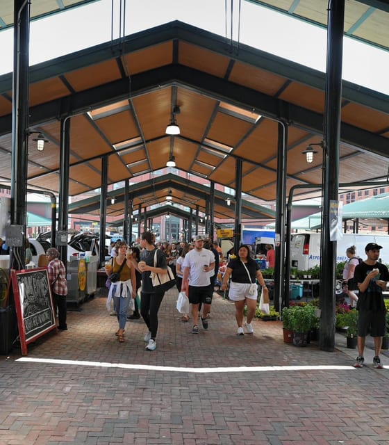
with Maple & Crate Learn more
Quick Links
Retail Tools & Resources
AddCompany News
Add

Events
Add event JUN06 Stoney Creek store grand opening
  JUN12 Summer staffing deadline
  JUL18 All-team summer barbecue
  AUG08 Local Harvest Festival launch
  25days
 Store managers, confirm your summer headcount in the Scheduling Portal before the cut-off.
Submit your availabilityHealth, Safety & Compliance
- Report a food-safety incident
- Handling & storage policies
- Safety video library
- Food retail regulations
Training & Career Growth
- Food handler certification
- Customer-service training
- Career pathways across stores
- Internal job postings
Store Operations Hub
- Opening & closing checklists
- Daily sales targets
- Freshness & expiry tracking
- Supplier delivery schedules
Maple & Crate Market, Retail KPIs
Reporting period · May 2026Concept design, hand-coded to preview the layout. Maple & Crate Market is fictional; all names, numbers and photos are illustrative. The real page is built directly in SharePoint.
Want help building yours? hello@tenantcraft.ca
What you’re looking at
Nothing on that page is custom-built. Every block is a standard SharePoint web part, set up by an editor with permission to the site.
Click a card to see the exact steps for building it.
01 Hero web part The green welcome band with the promo card beside it is a single Hero web part, set to a layered layout. An editor sets the headline, the copy and the promo image.
- Edit the page and add a section, then insert the Hero web part.
- Choose a layered layout so the welcome copy and the promo tile sit together.
- Type the headline and supporting line; upload the promo photo.
- Set the promo tile’s link so "Learn more" points somewhere real.
02 Quick Links: list layout The five links under Quick Links are one Quick Links web part in the list layout. Each row has a Fluent icon and points wherever you need: a portal, a library, a form.
- Add a Quick Links web part and switch the layout to List.
- Add each link and pick a matching Fluent icon.
- Type a short label for each row.
- Reorder by dragging; no code needed.
03 Quick Links: grid layout The six Retail Tools cards are a second Quick Links web part, this time in the grid layout with descriptions switched on, so each card carries an icon, a heading and a line of context.
- Add a Quick Links web part and choose the Grid layout.
- Turn on Show description in the web part settings.
- Add each link, choose an icon, type the heading and description.
- Drag to reorder the cards at any time.
04 News web part Company News is the News web part. Anyone with edit rights publishes a post and it appears here automatically, newest first, with the author and date drawn in for you.
- Add a web part and choose News.
- Set the news source to This site.
- Pick a layout and how many posts to show.
- Staff use + New, then News post; new posts surface here.
05 Events web part The dated event list is the Events web part. It reads a SharePoint calendar and shows what is coming up, with the date chip drawn for you.
- Create or pick an events list on the site.
- Add the Events web part to the page.
- Point it at the list and choose the compact layout.
- Add events to the list; the page view follows.
06 Countdown callout The staffing-deadline card is a Text web part on a brand-coloured section, with the day count typed in by hand. The "Submit" button is a button web part below it.
- Add a Text web part inside a section set to a brand colour.
- Type the headline, the deadline date and the day count.
- Add a Button web part underneath and set its link.
- Update the number each week until the deadline passes.
07 Coloured resource panels The three green department panels are Quick Links web parts sitting on a section with a brand-colour background. The section colour is a built-in setting.
- Add a three-column section to the page.
- Hover the section’s pencil handle and pick a background colour.
- Drop a Quick Links web part into each column, set to the list layout.
- Add the document and form links under each heading.
08 Quick Chart web part The Retail KPIs bar chart is the Quick Chart web part. You type the labels and values; for a live dashboard you would swap in the Power BI web part instead.
- Add the Quick Chart web part and choose the bar chart type.
- Enter each label and its value by hand.
- For live data, build the report in Power BI first.
- Swap in the Power BI web part and paste the report link.
More from the Studio
All scenarios →TWENTY MINUTES, NO PITCH
Tell me what is stuck. I will tell you what it takes.
Same consultant from the first email to the last cutover. If I am not the right fit, I will refer you to someone who is.